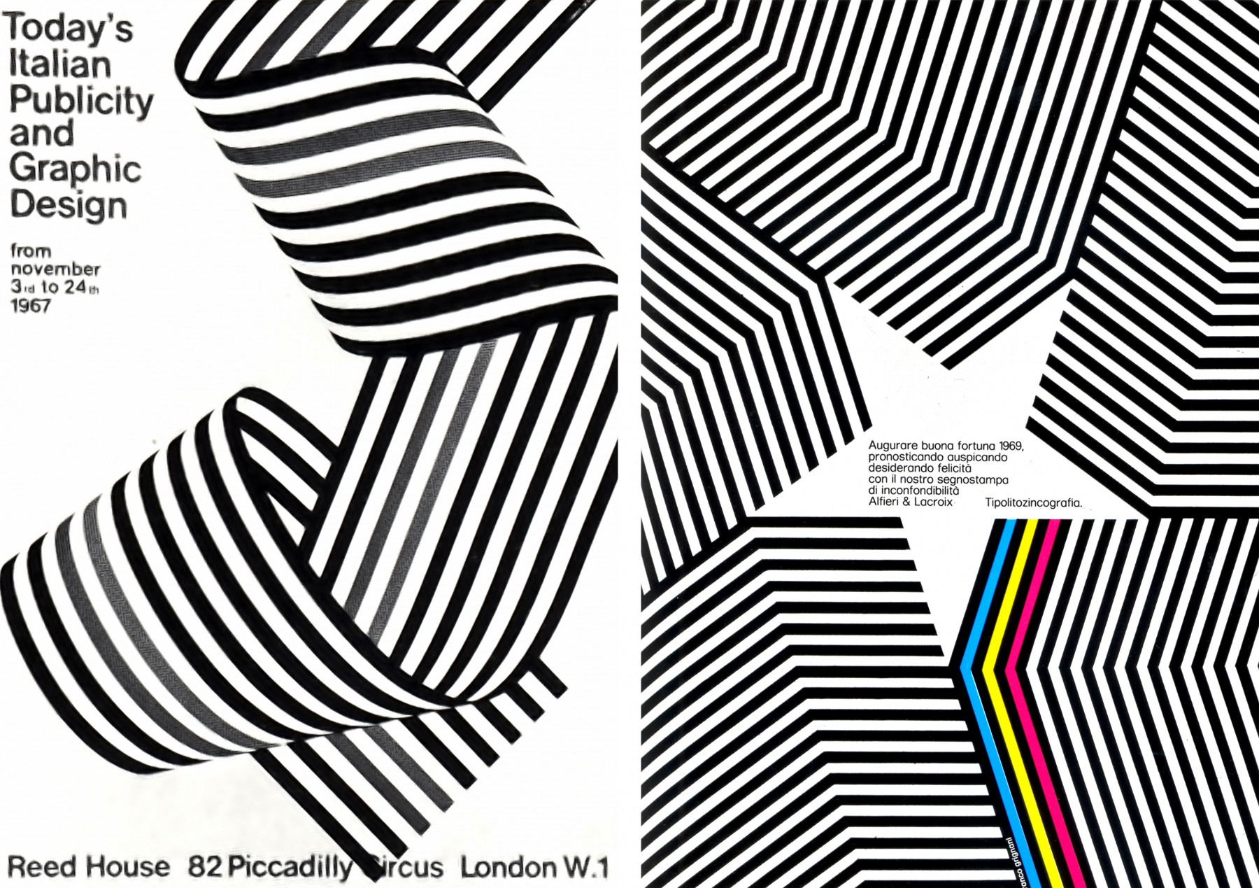
Franco Grigani
Franco Grigani is another Swiss designer (as well as a
painter and architect) but his backgrounds and imagery seems more busy and
dynamic than other Swiss designers. He studied architecture in Turin and
graduated, after that he took part in demonstrations for second wave of
futurism which included abstract geometry and constructivism.
He features a lot of lines in his work whether there guiding
they eye or contrasting with other imagery, also his backgrounds and imagery
contain most of the colour whereas his text seems to black and grid structured
over the top.
His design work is very typical of Swiss design that was
around when he was designing. It features illustrative focals or photography as
well as experimenting with colour and sense of depth. He didn’t seem to have a
set of particular colours he preferred, instead using the right colour for the
job in hand. White was often featured in his work and often balanced this piece
out.
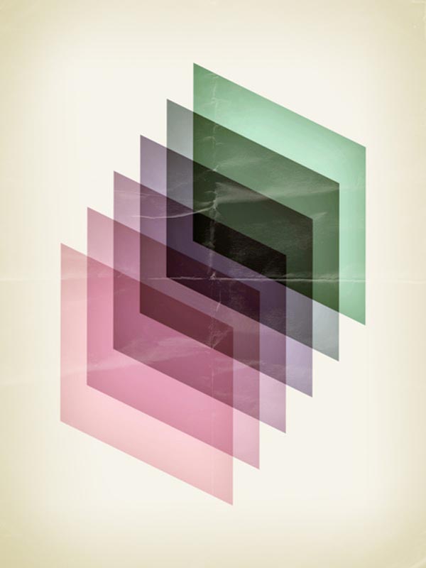
Quim Marin
Quim Marin produces modern interpretations of swiss design,
typically using pastel colours and geometric shapes. He also uses Swiss
inspired typefaces.
He makes very clean 80’s inspired posters, but the digital
aspect of the posters is more obvious, sometimes layering to create focals, or
a section of a photograph with a gradient. Almost like he experiments with
focals and then structures them in a Swiss format with typography added as
well.
Morten Iveland
Morten Iveland creates 70-80’s inspired Swiss pieces, using
simple shapes and or imagery to engage the audience. He uses very mild colours
which also gives a retro feel and look, also the typefaces he uses seem to
reference 70’s design. We would say that it’s the strong compositions that
makes these interesting. Each piece features a grain that is similar to typical
Swiss design pre-nineties, this gives each piece a vintage feel, like they’ve
been weathered. Another feature that seems to repeat his use of thin lines, and
text which isn’t typical of old Swiss design but doesn’t feel out of place.
Yusaku Kamekura
Yusaku Kamekura was a Japanese designer with strong sense of
Swiss design. He did some design for 1964 Olympics.
His posters are very intense and simple, often being known
as colourful minimalism. He used Swiss structure for text lightly and then
featured interesting visuals often circular or as a scene.
His constituent use of circles adds a running theme through
his work which adds a sense of a strong style and also seems like a style where
he’s most comfortable. His other work features softer, less abrasive colours
with a more interesting composition and also more texture is utilised. Most of
his text is in Japanese writing which works well but can create awkward shapes
in large groups of text.
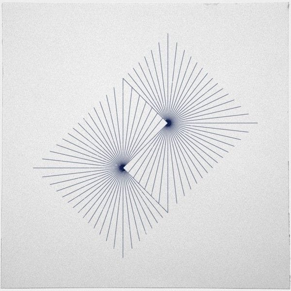
Tilman Zitzmann
Tilman Zitzmann is a designer with a blog called geometric
daily. He designs a simple new piece of geometry every day, experimenting with
shapes, lines and textures. Tilmann’s geometric experiments are simple but
effective always managing to be interesting to some degree, he experiments with
layering of geometric shapes as well as creating pattern with shapes and
colours. He also plays around with composition and contrast sometimes using
half shapes and juxtapositions them together.
Tilmann also seems unprejudiced when it comes to colour
selection, using pastel colours, dark shades and also blander colours often
contrasting them with other colours inside the piece. Some pieces seem more
artistic than design but there all experiments so it’s not a bad thing.